At the time of writing, this exhibition of fourteen small paintings has not been documented on her website (www.helengblake.com). Their sizes around A 4 or a one fifth bigger forge a call for privacy, not unlike covers or title pages of closed books or files. The visual hypnotically attracts silence and contemplative attitude – not an overt discussion or a sharp analytic critique.
The mesmerizing illusion of rectangles descending into a depth oscillates with flat marks that refuse to be either planar or linear, behind the concentric blue frames, descending to the centre. Behind them, the fragments of the green, pale blue and black almost succeed to insist on being a continuous plane, especially the green hue labours along that wish. Yet, just few of the light blue uncertain shapes positioned in haphazard repetition have punctured holes in any pretense of flat ground. The black grid adopts two positions – as a ground and as a stitch over a green ground. What could have been an indeterminate juxtaposition becomes a prisoner behind an alley of bars.
Impluvium was a right angled indentation to collect rain water inside a Roman atrium house with an opening in the middle – no roof. The Latin verb impluere translates as rain into. The painting ignores the possible representation of an atrium slowly collecting raindrops – filling the whole with busy grids of green, black, pale blue and blue grey. The rapid march of rectangles towards the calmer centre calls on symmetry to dominate the fragmented areas, similar to how a chromatic chord can steady a shrill of a melody ( the pale blue over the black) . This painting knows about op-art. Differs by emphasis on hand made uneven marks and distances. It achieves an illusion of depth by leaving the green rectangles in the middle in stasis that contrasts the rapid march from edges to the centre. Helen Blake thinks of ” colours in conversation” – and makes it visible to me.
Their conversation is not entirely harmonious. Some are louder and overwhelming others. Yet the splinters of pale blue do get “heard”. They pierce the hegemony of others. It is not just the hue and tone, it is also the pathway the painter selects for each that strongly contribute to the illusion of sound, and feed the association with architecture…
The illusion of volume rising up from right to left anchored in a mid-point – evokes synesthesia as well as an association with architecture. Where the Filling the Impluvium image is grounded in a function, here the image is dependent on appearance, on similarity to seats in an amphitheatre or to a modernist roof construction. Even when no association is welcome, the differences in high key of the ground plane and near monochrom of the related curves invite a dialogue.
It’s title refers to a place, a field, the image does not correspond to a particular, familiar or not, natural surface. Its world is thus elsewhere. The pale hues cover those underneath in a somnolent shade of grey pushed to life by the energy of the singularity of pink – and its art deco figuration in two colours. It is also a reminder of classical Greek architecture, the Doric order’s triglyphs.
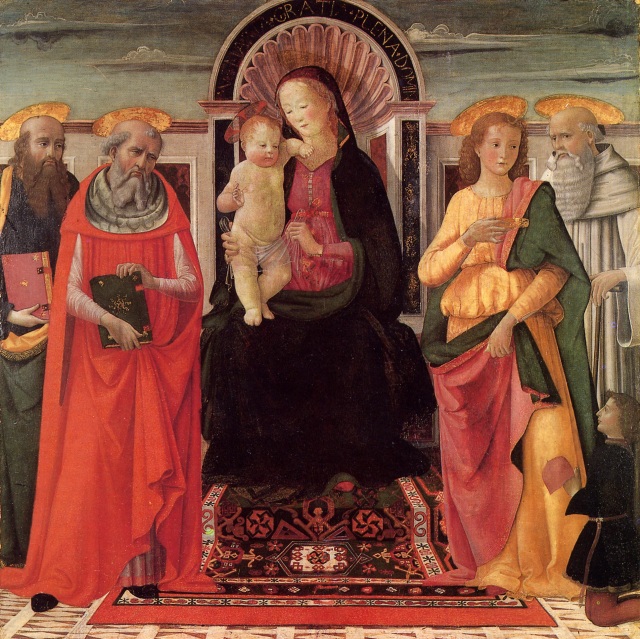
This petite colour field is also a kind of visual dialogue between the geometric confident figure and somnabulous fogg over the grey part. The Doric order is masculine and rational. The grey abstract is mysterious and withdrawing. The olive green on the left sonorously reminds of missing colours patiently waiting outside the frame. This, most “silent” of exhibits stubbornly insists on values of contemplation. It is more of a memory than of a salute, reminiscent of old tradition of other world – as nourished by multitude of painting on a theme of Sacra Conversatione/Santa Conversazione. The vertical pattern looks at the grey horizontals conjuring a symbolic world. In parallel and perhaps memory of “disinterested” saints surrounding a Madonna and her vision of the other world.
Even repeated abstraction hides anthropomorphic forms in free association … and when the visual looks so fiercely at a viewer.
Not just hue and tone also texture seem to be deflecting the tradition of Apelles and Zeuxis in favour of importance of “thinking in images”. The repetitiveness of thought is diminished by the appearance of low relief of paint in blobs. It reminds both of string theory and fuzzy logic as two patterns of cognition. The irreverence to the austerity of the uniform figures is embodied in the intoxicating movements of the brushtrokes, even if with some tiny mannierisms.
Mayfly Screen is most complex among the painting exhibited together.
Multitude of converging contributions do not repel attention to the the whole, an ever so disciplined central composition. The blue holds itself out of true horizontal as if in a effort to connect, behind the screen with the two orange/red fragments. It introduces element of play, irreverent disobedience of the rule of symmetry.
A more passionate conversation of colours than the previous ones and less loud than the Filling the Impluvium. Blake’s abstraction achieves the same convincing presence as Altfest’s painting of known reality.
Both images appeal to our contemplative faculty – such a welcome intrusion into ordinary world, our ugly, noisy and violent world, deliberately accentuated by the curator of this year Venice Biennial.
Blake’s paintings speak of a different future.


