

Stuart Calvin wrote to me:
“The process for creating the plaster forms involves pouring the plaster directly onto a flat smooth surface. Before the plaster fully sets, I shape them until they are slightly domed.

The plaster is then air dried and repeatedly sanded to achieve a smooth surface. The gold leaf is applied in the traditional way using size. In the past, I have various types of adhesive but none of them achieve the very reflective finished attained with the size. ” (email 7 May 2017)
The first impression is of a pathway leading to a locked door
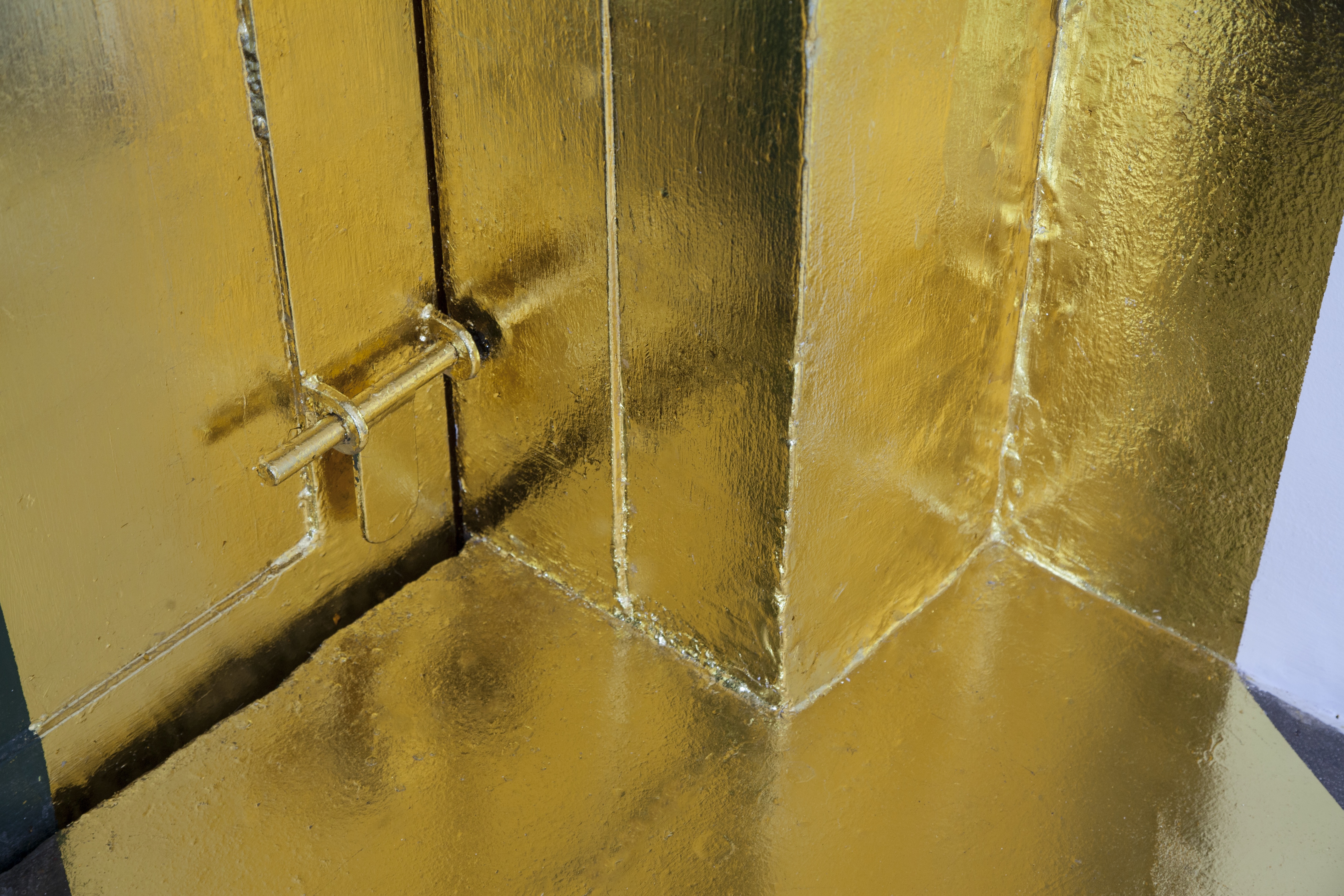
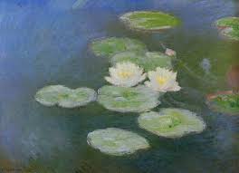
The second impression is of abstracted “waterlilies”…

Imagining the lake at Giverny… the white shapes reflect in the gold leaf and also above the grey – as if floating on water.
Pathway and waterlilies have a history.
Richard Long introduced the actual path as a confident art object.
“My work has become a simple metaphor of life. A figure walking down his road, making his mark. It is an affirmation of my human scale and senses.” (accessed on http://www.theartstory.org/artist-long-richard.htm

A Line Made by Walking 1967 Richard Long born 1945 Purchased 1976 http://www.tate.org.uk/art/work/P07149
Pawel Althamer followed by intensifying the mark in his Path for Skulptur Projekte Munster 2007.

However, a “road” as an ideal sculpture has been first offered by Carl Andre:
“The sculptural form is no longer an end in itself, but rather the residue of an intervention into space. Brancusi’s Endless Column (1938) has often been cited as a point of reference – a reference sustained by Andre’s own comment: ‘My idea of a piece of sculpture is a road. That is, a road doesn’t reveal itself at any particular point or from any particular point’.”(Carl Andre in Phyllis Tuchman, ‘Interview with Carl Andre’, p.49 in Carl Andre, Sculptor 1996 (Krefelder Kunstmuseen and Kunstmuseum Wolfsburg, Oktagon Verlag, Cologne, 1996)
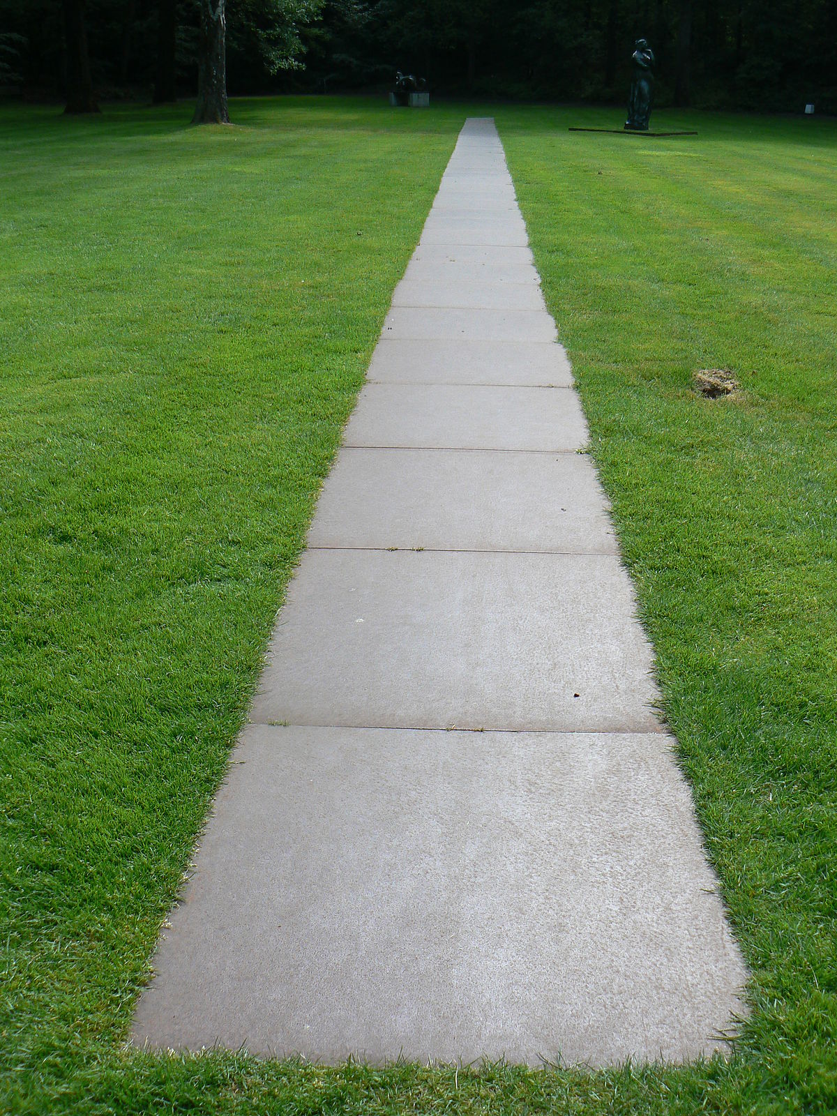
Carl Andre, Kroller-Muller Sculpture museum
What is the salient point of a difference between these outdoor – land art – versions and the golden leaf indoor one? Well Calvin’s is handmade. It is an affirmation similar to that admitted by Richard Long.
Golden leaf has a history of being used to forge an illusion of endlessness, abstraction for the imagined heavens on medieval altarpieces, for ex Duccio di Buoninsegna painted the dualism of the earthly and the unknown similarly with heightening the contrast by painting the sky gold.

The calling of the Apostles Peter and Andrew, 1308 -1311
Gold marked something as “heavenly” also in medieval manuscripts before Limburg brothers – among others, replaced the “believed” by the “observed”.
Significant is also the fusion of painting and sculpture while the gold and white inspire separate associations. Calvin is working in the cracks between painting and sculpture giving an equal presence to both.
The other narrow area he patiently invites me to consider is the ceramics, one of the Lesser Arts defended by William Morris at the end of the 19th C. His lecture was greeted with embarrassed silence. Such a lower art be allowed to enter the High Art of the Academy? And here even trampling over the precious gold?
The white colour has a history of symbolising, purity, perfection, innocence, of new beginnings. The gold, in comparison, stands often for wealth, power, magic and wisdom. Both gold and white colour stand for perfection.
Calvin’s choice is uncanny – both colours associate with some otherwordliness, while white is the colour of a common mineral, and gold is seriously rare. Ceramics has a history of practical use, gold’ s history witnesses battles, death, power, as well as that Duccio’s trust in gold being not corruptible.
The 2oth C has removed the hierarchy of the so called High art and Lesser art, in Picasso’s case with a verve and humour .
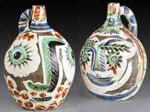
And yes, these vessels have a practical purpose too. Those in our installation are disabled to become of use in practical life.
The white shapes that hover above and reflect in the gold leaf

court an illusion, however fleeting and insecure, of being painted. They even appeal to musical association – like irreverently strewn around notes and intervals…

(This particular shot allows a complete lie, a charming one, homely one, of plates hurrying to the ground from the golden table in some fairy tale you may recall or invent. Those two verbs are also keys to this kind of art. It invites you to dream, to imagine, to invent, it lets you into the kingdom of freedom. Unless, until, you reach that locked door of rational sensual world. This observation is salient to the extent to which Calvin approved this view. It is his photograph. His art is in viewing, looking, seeing.)

This installation is sheer poetry. Beautifully made. As the artist say “Greater that I”
The installation does not say that, but it does not deny it either. It does not say, does not show, does not represent – it is.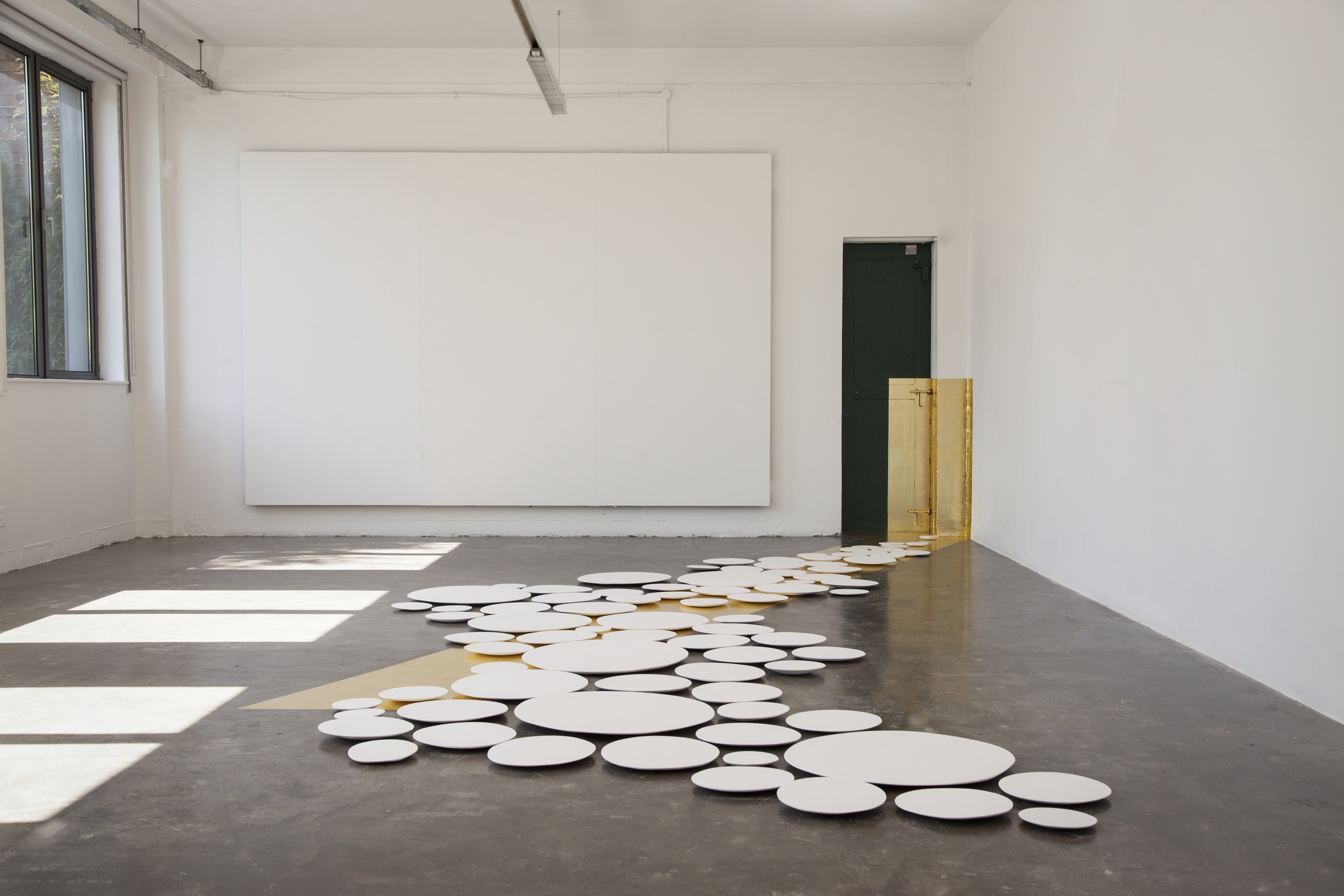
(This photograph invents a relationship between the gold and plaster and the sunlight drawing the windows shapes on the floor. It allows an interpretation of strict disciplined order of the universe and a crowd of shapes huddled together, nowhere to go. In this view another part of our history wriggles into my attention: The Celts built beehives houses for safety and protection, whereas the more successful Greco-Romans building preferred the right angle. The sunlight coming through the right angles of the windows on descending on the floor issues authority, uncross-able boundary, which the round shapes are made to face.)
The tenor of this art is the sublime grounded in the beauty of the whole. I hasten to add – details offer heightened aesthetic experience, when touching the velvety surface of the white shapes.

This art’s power is in its submission to absence of practical instrumental value (so trusted by Arts Councils for ex). It is art free of easily defined goals. It offers no one narrative to lead the viewer to some expected result. Even the verisimilitude is banished – not depicting pre-existing object. Yet is is not just a wild fantasy – pathways are real and as well as a turn of phrase for process, for becoming. Plate shapes are omnipresent across cultures, installation is an established way to make visual art.
Calvin has achieved a unity between the two elements, the two different orders, by positioning the right angled boundary and free floating ovals both directed to that locked exit – but with a salient difference in the visually transmitted decision. The right angled path hits and climbs up to the lock. The white plaster shapes are hesitating. Both fail to find the exit.
I discern a new narrative – this art does not depict an object, or an experience, it creates experience. The installation is beautiful and by that it disarms many possible objections.
It also activates peaceful uncertainty of what you see. White colour has been used by architects in late Middle Ages and early Baroque to enhance the “spirituality” of a place, space that invites you by lower sensual definition and greater contemplative force.

Brandenburg, 1521 (accessed on Wikipedia)

Zdar, Zelena Hora, by Jan Santini Aichel ( 1677 -1723) (accessed on Wikipedia)
Photographs of “Greater than I” by Stuart Calvin.

